Based in London, but raised in Coventry, Paul retains a huge love for the concrete icons of Brutalism and Modernism that framed his childhood. The subjects of his prints have included celebrated landmarks such as Battersea Power Station, Tate Modern and St Paul’s Cathedral, as well as controversial buildings including the Elephant and Castle Shopping Centre, the National Theatre and Telecom Tower.
Drawing on the best traditions of classic midcentury poster design Paul utilises his expert eye for composition and colour to inject his prints with fresh energy, dragging old icons kicking and screaming into the 21st century and imbuing new buildings with a nostalgic edge.
We were thrilled to catch up with Paul and find out more about his life and work, and talk all things Brutalism!
Interview: Matilda Barratt in conversation with Paul Catherall RE.
Could you start by telling us a little bit about yourself and your practice?
I was raised in Coventry and studied illustration at De Montfort University, moving to London on graduation. I became a jobbing illustrator working in a painterly style for magazines, packaging and book jackets. After slogging away at this for about 9 years there came a turning point and I chose to manically pursue linocutting. After seeing Michael Schwab’s screenprints of San Francisco landmarks I set about producing prints of London architecture. Numerous group and solo exhibitions followed over the years and also the odd nice commission from the likes of TFL, Southbank Centre, Royal Shakespeare Company and Penguin books. I’ve recently had a solo exhibition with Eames Fine Art focusing on Coventry architecture – the place where it all started.
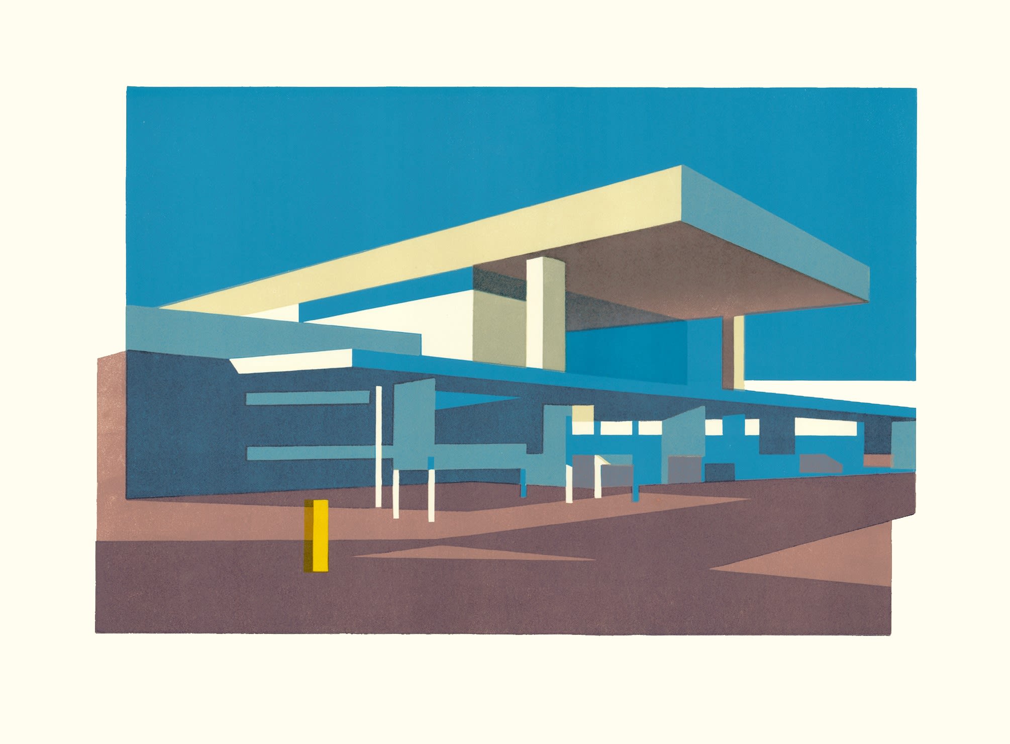
Coventry Station, Paul Catherall RE
What is it about the built environment - and concrete brutalist architecture in particular - that inspires you?
Over the years I’ve realised that it must have been my upbringing in Coventry that subconsciously ingrained a love for modernist and brutalist architecture. There’s a sense of nostalgia for me in that style and I found myself drawn to places like the Elephant & Castle Shopping Centre and Southbank Centre when arriving in London.
I also remember wanting to record some of the changes in London around the millenium such as the Eye, Millenium Bridge and transformation of Bankside Power Station into Tate Modern. Also that style of architecture completely lends itself to the sort of simple design and areas of flat colour & tone that I greatly appreciate in classic mid century poster design.
You studied linocut printing as part of your degree in illustration, but it wasn’t until later that you took it up again. What was it that first attracted you to the medium, and why did you decide to return to it?
I just remember enjoying the immediacy of linocut on my degree. I didn’t have the patience to be precise and careful then so it was pretty messy with lots of finger marks but I think I appreciated the directness of the proocess – with painting you never knew when something was finished and you could lose the immediacy but with print it was unforgiving and you basically got what you got!
One of the reasons I returned to it was because I could be a cottage industry and do them from home and just get on with it. In a way I was trying to recreate travel posters on a small scale. William Nicholson was also an early influence and during my transistion I started with figurative / portrait prints before embarking on the architectural subject matter.
You’ve had some very high profile commissions, from British Airways and Transport for London, to a commission by the House of Commons to mark the Queen’s Diamond Jubilee - has there been a favourite, or a particular project that really stuck with you?
The first commission for TFL of the Tate Modern was a very big thing for me and I fretted over it until I drove myself mad. The most satisfying was the second commission for them which was a set of four called the Four Seasons and was the view from Oxo Tower Wharf looking towards the city, designed to work as a landscape when the four were displayed together but also as individual posters.
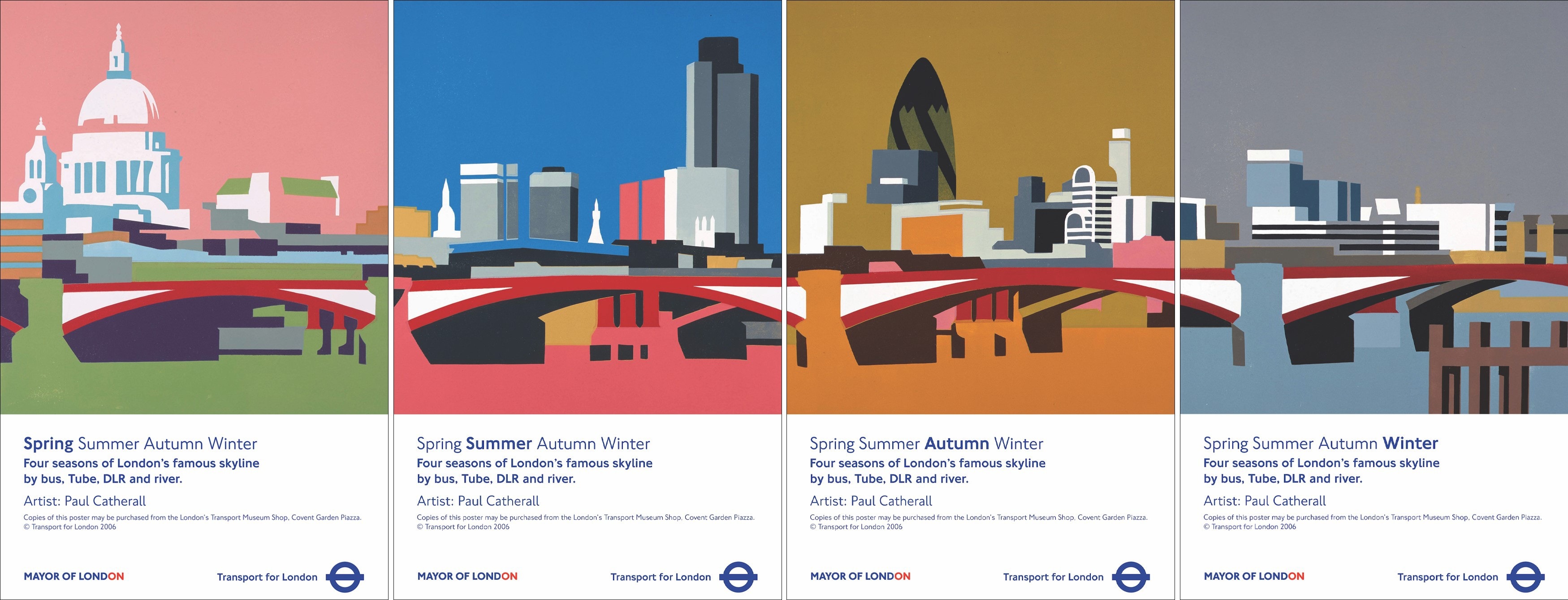
Left to right: Four Seasons Spring Poster, Four Seasons Summer Poster, Four Seasons Autumn Poster, Four Seasons Winter Poster.
I’m interested to know what routes your career has taken to get you to where you are today - I understand that you started out as a figurative illustrator?
Yes, at Leicester I really loved sketching people and life painting and during that time I attempted to transform this into a painterly figurative style of illustration. I slogged away for about nine years working on magazines, packaging and the odd book cover but always found it hard to recreate the immediacy and fluency of a life painting. I got a bit fed up of the stress of chasing commissions and found myself with two options – buy an iMac and retrain as a graphic designer or do something that I would like enough to put up on my walls – linocuts! After a day attempting to master the iMac and nearly taking a hammer to the screen in frustration I realised that ‘hands on’ was a much better suit for me. So I intially created the odd figurative lino but after seeing the previously mentioned Schwab images for Golden Gate National Parks, and it being the build up to the millenium, I just thought that architecture would make a great theme and also a refeshing change from figures. Buildings don’t moan or move when you’re asking them to keep still or take reference photos!
I also decided to get the prints out there through exhibitions rather than the soul destroying process of calling possible commissioners asking them to spare five minutes of their time to see my portfolio. Fortunately, people seemed to like the prints and I managed to sell some – I think that landmarks have quite an emotional/personal attachment with people with related significant memories or events. Also Michael Waltion who commisioned posters for TFL came to one of my early exhibitions – I’d bombarded his whole department with flyers and he gave me my first break with a commission to represent the recently opened Tate Modern for a poster. For six years I worked three days a week at The Stage Newspaper as the post boy to supplement my linocut sales – spending the other two days and virtually every weekend and evening working on the linocuts.
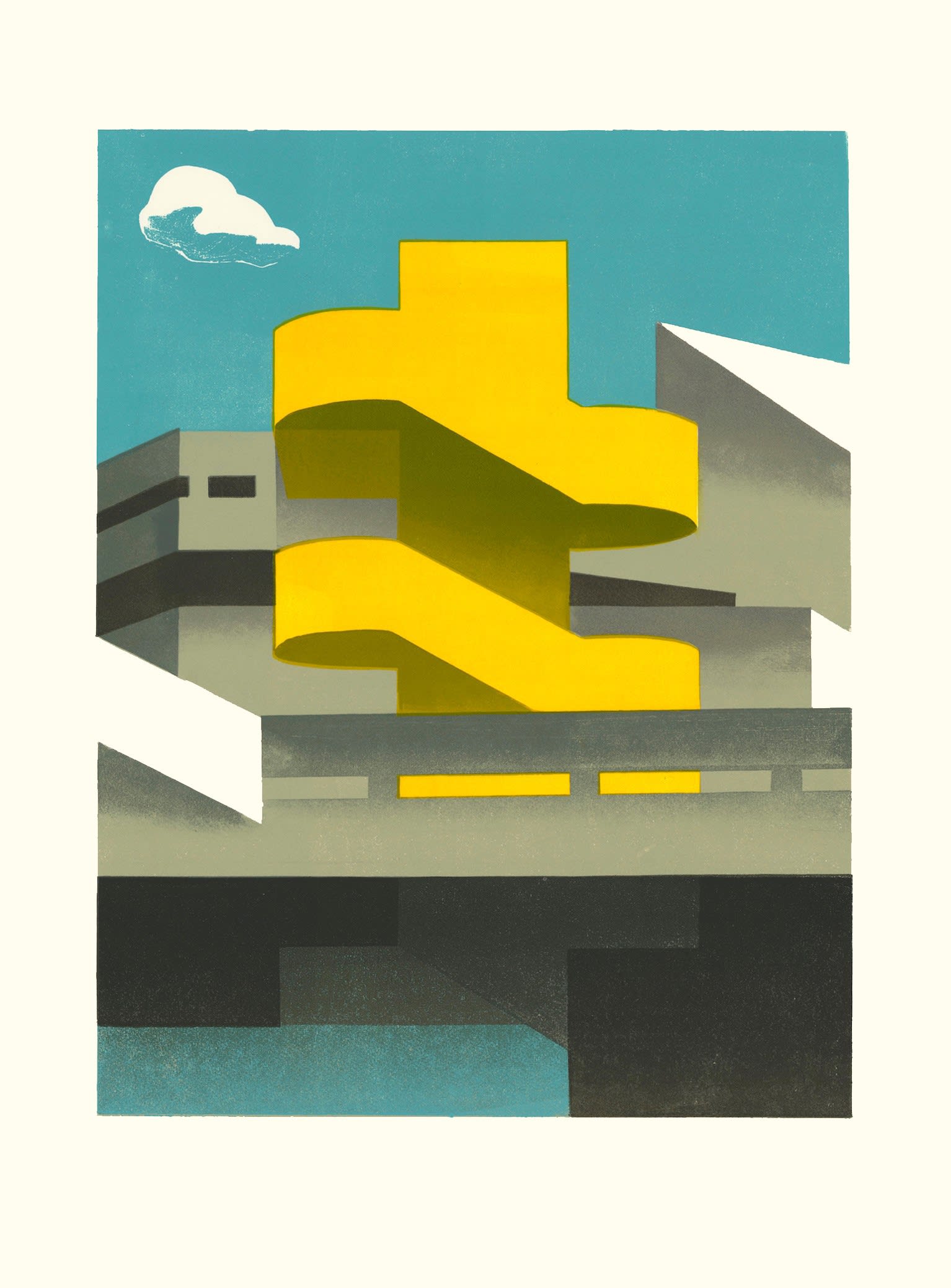
Southbank Steps Yellow, Paul Catherall RE
Your linocut printing sounds like a painstaking process - one image can take up to eight weeks to complete! With this in mind, it did make me laugh to read you describe it as a ‘sophisticated potato print’. Could you tell us a bit about your printing process?
I really love the different stages of producing a linocut. The initial planning stage is where all the hard work is done really. I draw on tracing paper and slowly develop designs using elements of the previous composition until I have a large pile of line drawngs - each one a refinement from the last. When I’ve finally got to a good composition I usually paint a small gouache study to work out the colours - sometimes this can just come together quickly or it’s a rather painful process of producing four or five until the colours work. Then I’ll draw up to scale the ‘master’ design in pencil – again refining and moving lines by just a few millimetres. I use this master drawing to trace directly onto the lino plates. I use a mix of seperate plates for some colours and also part reduction process for others. It’s a bit of a jigsaw puzzle really where I like some colours overlayed and others just pure and straight onto the paper. After the rather mediative process of carving I then use the master drawing traced in reverse onto a large piece of card that I use as my registration plate. I draw out the whole thing so that the individual lino blocks can sit exactly in their place. I carefully work out where the paper should be placed and just use one straight tine with pencil marks that are then extended onto each sheet of paper when the first colour is printed. That means that each sheet will go back exactly where it was for each subsequent colour.
I almost count the carving period as ‘time off’. I manage to concentrate but listen to music and the radio or podcasts. I find this satisfying as you always actually produce something when previously you may have struggled with a drawing for days...
Then it’s back to the full concentration and decision making when mixing the colours and printing colour by colour. This is either really painful and annoying or beautifully satisfying when a few colours print well and start to ‘sing’ on the paper. I often make a cuppa and just enjoy how those colours look when this happens.
Before you get to carving, what is your process in the earlier stages? How do you go about choosing your subject matter, and do you draw in situ or work from photos - or a bit of both?
In the old days given the luxury of time I used to sit and sketch in situ, but now I usually wait for strong morning or late afternoon light and take as many photos as I can. I have a long list of modernist and brutalist subject matter that I’m slowly working my way through. I’m currently planning on doing a few more of Coventry.
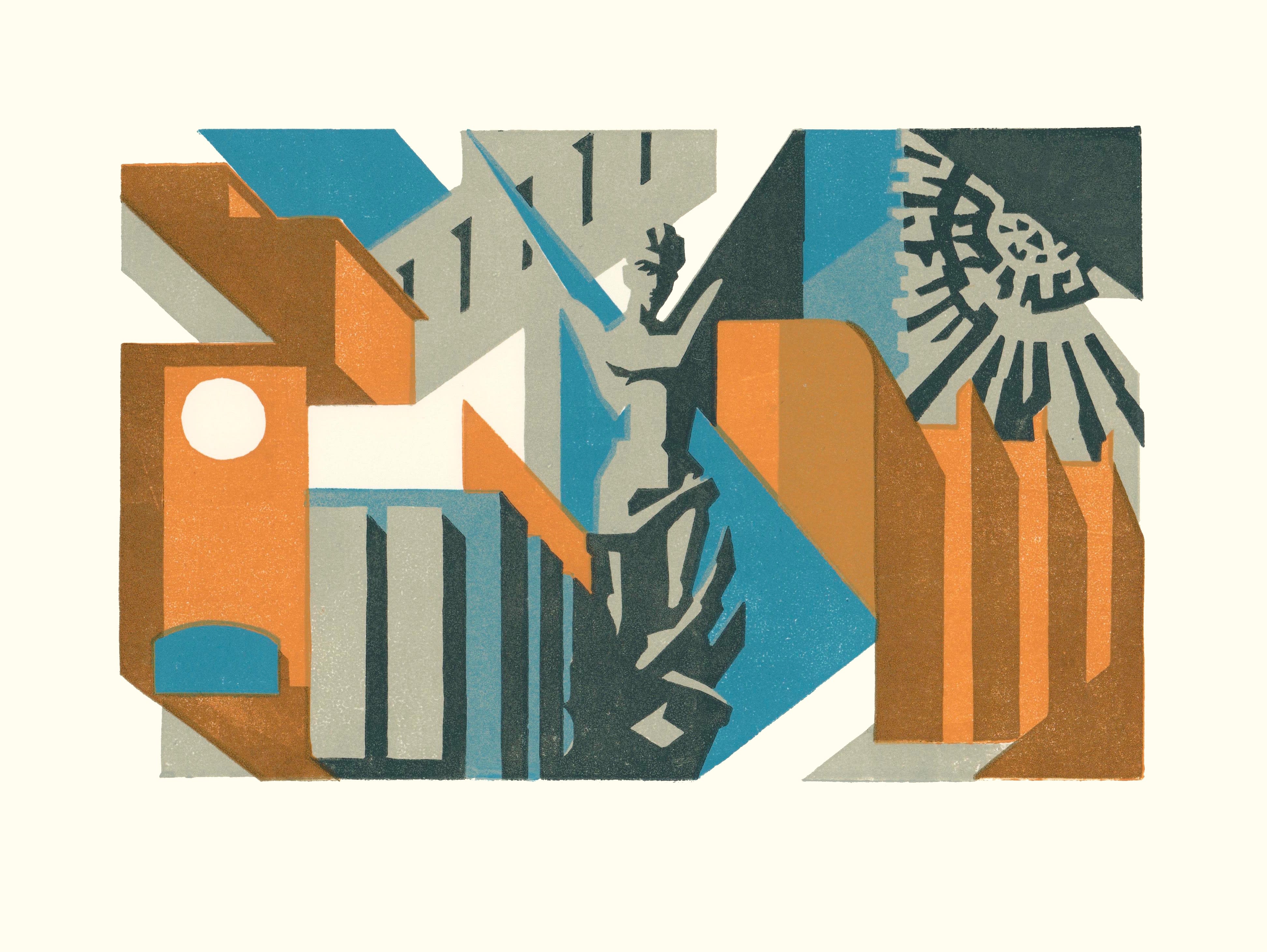
Coventry Modern, Paul Catherall RE
I imagine that some buildings are more straightforward as subjects than others. What have been some of the more challenging images that you’ve worked on, and why?
I find buildings that don’t have much of an interesting silhouette a challenge. Some have good details but usually it’s the outline that counts.I had a couple of commissions such as Portculllis House in Westminster and Voysey House in Chiswick that were quite a challenge. Give me an irregular shaped brutalist icon and I’m away!
What do you hope to achieve or capture with your work?
I like to show some of the much derided brutalist and modernist buildings in a clean, positive light – almost like the original archtect’s drawings. Many of these places haven’t had much investment and look scruffy with poor upkeep and can look rather bleak on a rainy day. I try to capture and highlight the dramatic design. Just look at how the whole area of the Southbank has been revitalised after some care with cleaning, lighting, outside seating etc.
I’m also trying to ‘record’ the buildings as they are – quite a few places are either under threat, redeveloped beyond recognition or have already gone so I’m almost archiving them. This is very apparent with my Coventry prints – almost all apart from the Cathedral had changed in some way or their futures are uncertain.
Lastly, I just like to create a mood or atmosphere with certain colours and tones. Like a musician would say about their songs – it’s up to people to take whatever feeling that may get from your art and there’s no right or wrong.
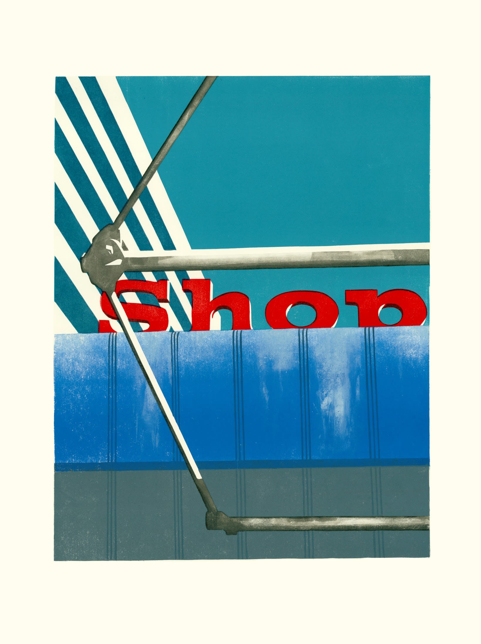
Elephant Shop, Paul Catherall RE
What does a typical day look like for you? I imagine this will have changed quite a bit in the last year…
Yes – homeschooling was not part of the original plan!
I do virtually all my drawing and carving from home and then have concentrated spurts of printing at Artichoke Print Workshop. So typically if working at home I’ll draw or carve for much of the ‘school’ day and if busy quite late into the evening after the kids are in bed. I tend to listen to music or radio at home and the hours do fly past.
When printing I’ll cycle down to Brixton from N16 after the school run and sometimes print well into the evening, particlarly if an exhibition is approaching.
Some days are faffing days when there’s prints to post, emails to answer and general admin stuff.
Finally, do you have any words of wisdom for aspiring and emerging artists?
Very simple – work hard and don’t give up. There’s lots of ups and downs along the way. If you trust and enjoy what you do then stick it out. You need to get the work out there and spend as much effort doing that as doing the actual artwork - especially in the early days.
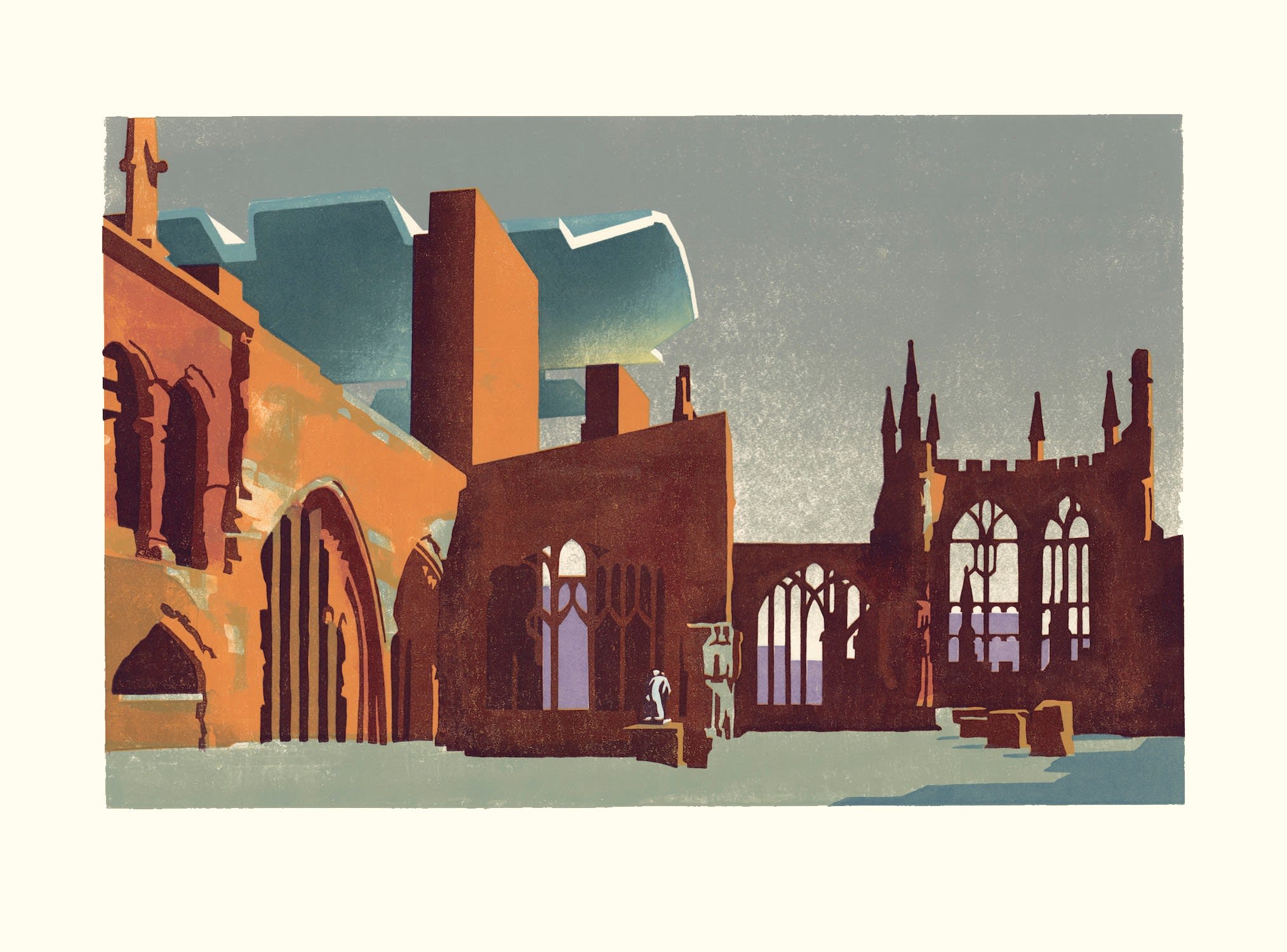
Coventry Cathedral, Paul Catherall RE
If you would like to find out more about Paul, you can follow him on Instagram or visit his website here. You can also browse more of his artworks through the button below!
More like this on the Blog...
Read: The Poetry of the Everyday: Interview with Anita Klein PPRE Hon. RWS
Read: Interview with Akash Bhatt RWS
Read: Interview with Sumi Perera RE
Read: Interview with Peter Lloyd RE
Read / Watch: Relief Printing: In the Studio with Trevor Price RE

